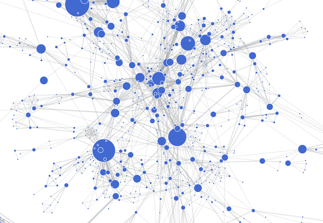
One of the parts of the Digital Preservation Workbench I’m most pleased with is the iPRES author network visualisation. This visualisation builds a network out of all the 2004-2023 iPRES metadata, where each node is a unique author’s name, and the size of that node reflects the number of things they have published. The nodes are connected when the two names appear as co-authors on the same publication, with the ‘strength’ of that connection based on the number of times they’ve published together.
It looks like this…

But an image doesn’t really get across how much fun it is to fire up the visualisation yourself and play around with it. Best of all I love the way I entirely accidentally failed to constrain the graph to stay within the boundaries I’d placed around it. Once it’s running, it spreads and wanders across the whole of that page, with little clusters of people floating freely over the top of the text. Love it.
Now With More D #
Since building that, I’ve been keeping an eye out for other suitable visualisation techniques. Eventually, one turned up.
So now, there’s a new version.
I think it’s even cooler.
No spoilers.
A
